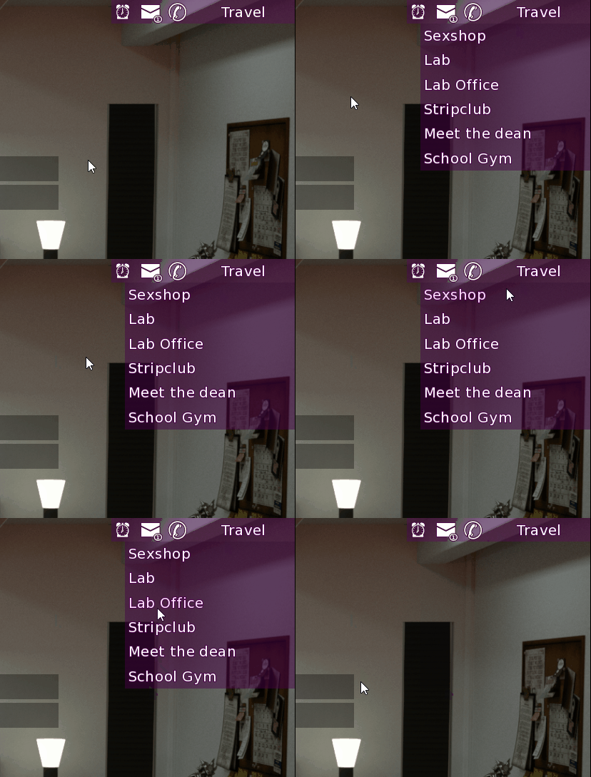
After a ridiculous amount of time spent battling the stupidly unintuitive and badly designed UI system of Ren’Py, I finally did it.

Seem simple enough, right ?
WRONG
Really, Ren’Py is not designed to make nice interactive UI. Doing something of that kind is pretty much just hacking you way through it.
Believe it or not, that simple behavior took me around 8 hours.
You might think I’m exaggerating or that I’m exceptionally bad. Well, I can assure you I’m not exaggerating at least. I don’t consider myself bad either.
I think I may have took so much time because of my thought process is mostly incompatible with Ren’Py overall incoherence. There I think lies most of the issue.
Anyway.
Now, it works. And I have a pretty good understanding of what is going on, so I think I won’t see much aberrant behavior.
As you might have noticed I also added the option to travel directly to the Lab’s Office.
Other than that, I also made pass on other issues with the UI such as issues with the contact menu and optimization of the SMS threads.
